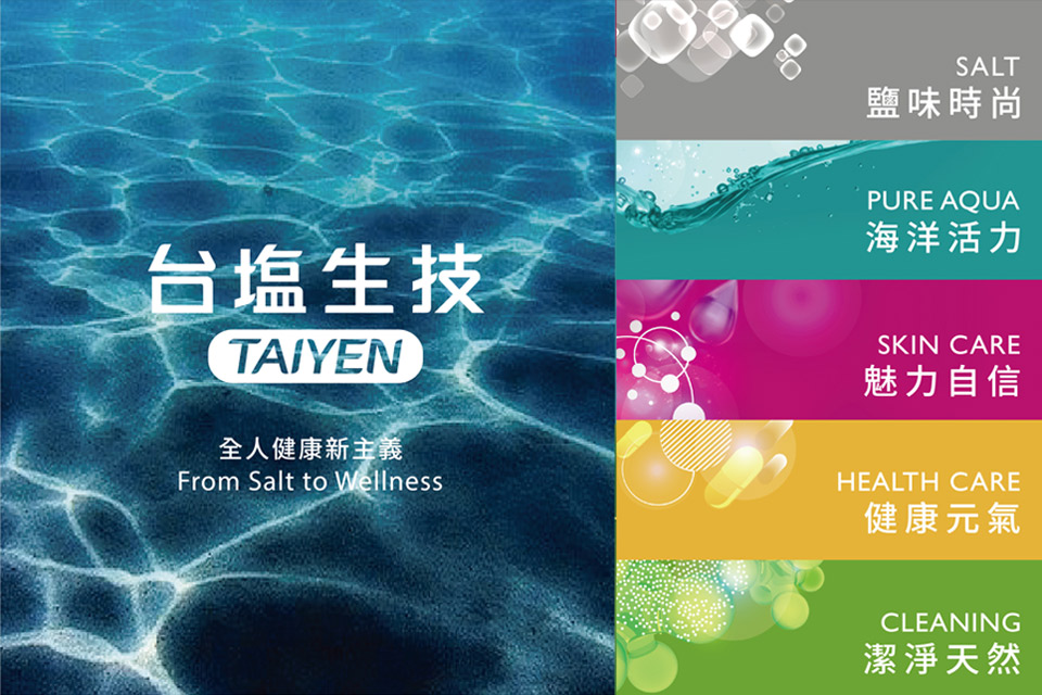
TAIYEN CIS


TAIYEN Corporate Identity Design Concept
The TAIYEN Biotech logo is based on pure ocean energy as the design spindle, mainly based on Chinese and supplemented by English.
Chinese fonts use a wide and spacious blank space to represent the pure characteristics and open structure of TAIYEN Biotech. It also brings more value and possibility to the whole person wellness and continues the entrepreneurial spirit.
The English font TAIYEN is designed with the gradient blue of the combination of sky and sea as the background, and it is surrounded with a circular arc-shaped frame. The corners of the font and the slightly oblique angle are designed to symbolize the mobility of the ocean. Self-confidence and professionalism of the brand can be highlighted, beneficially recognized by consumers in a variety of categories of product packaging application, closer to the consumer's life.